OPTICSvis: clustering, visualized
Milestone 1
Introduction
Our project idea is to visualize the resulting data from running the OPTICS algorithm on a given data set. OPTICS does not generate a simple mapping of points to a cluster ID, but rather outputs a list of reachability data—that is, the length (given by, e.g., the euclidean distance between those two points) that the algorithm had to jump from a given point to another. Short distances are preferred by the algorithm, so a series of short jumps likely marks a cluster.
However, in the end the user is looking at nothing but numbers and has to discern the patterns in the data himself. As such, the first step after running OPTICS is usually to draw a bar chart, which makes this task much easier.
As such, visualization is arguably already a core component of cluster analysis when using OPTICS. Why not allow for further manipulation of the algorithm, allowing to specify parameters such as the minimum point size to qualifiy as a cluster, or the cutoff distance that is applied onto the reachability data to define the actual clusters?
Furthermore, OPTICS is inherently capable of producing hierarchial clusterings, but this information is oftentimes discarded in favor of a simpler representation. Procuring an visualization method that is still simple, but allows for evaluation of hierarchial clusters is surely a worthwile undertaking, and one that we will strive for.

Why do this and to what scope?
Not many tools exist that take on this subject, although notable projects exist, especially Clustervision [1] and a DBSCAN visualization that we found [2], the latter of which only visualizes how DBSCAN goes about finding clusters (i.e. shows the epsilon neighborhoods). It is notable that DBSCAN results in a simple partition of points into clusters along with some metadata (e.g. core points versus edge points).
Clustervision is an especially powerful tool and takes on a multitude of algorithms (including OPTICS) and offers additional tooling like dimension reduction using TSNE. One of the core tasks of this tool is to validate the results of the algorithm—i.e. enable the user to check out the features of points in a cluster and see the relations between data that caused them to be classified into the same cluster.
This is something that we do not want to do, as we strongly feel that this is out of bounds for us. We want to make an example of simple data (i.e. low dimensional and spatial, a list of real points) and how the results given by OPTICS relate to this data set and the used settings, and show the partition derived from the reachability data.
Project details
- Project type
- Design study
- Group
- Tasks
-
- Visualize data (as point clouds)
- Visualize OPTICS results in an interactive and accessible way
- Experiment with different settings for the algorithm (educational aspect)
- Users
-
- Students interested in the algorithm
- Teachers for presentation purposes
- Scientists that just want something to quickly use density based clustering
- Scientists that want to see if this algorithm fits their requirements
- Dataset
- User provided or predefined points
Preliminary Project Solution
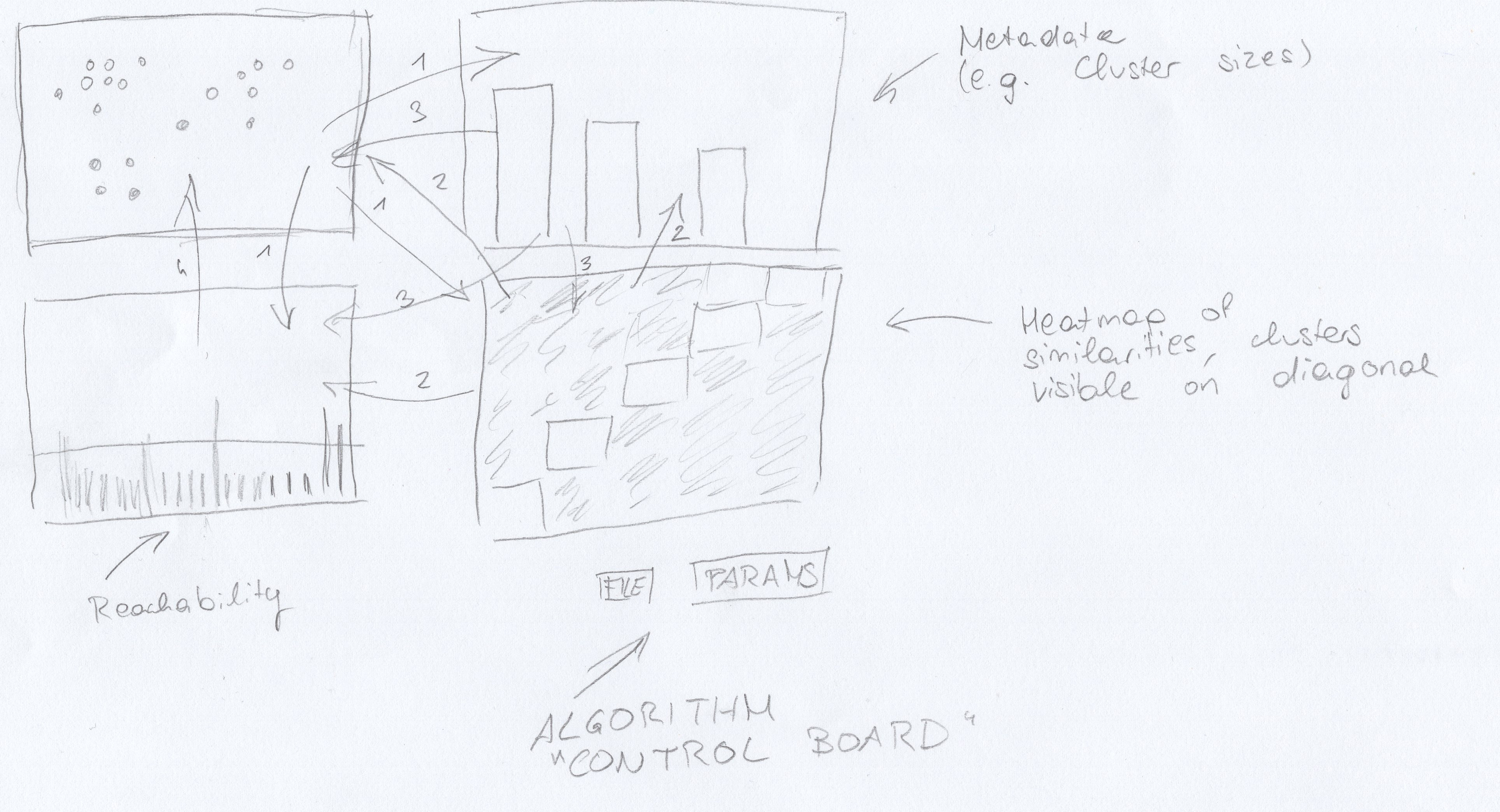
A preliminary solution could consist out of a scatter plot visualizing the input data, a bar plot visualizing the reachability data, as well as a heat map that visualizes similarities. Another view may be used to show miscellaneous metadata such as the number of points per cluster. A small dashboard is provided to change algorithm parameters.
Separation of Tasks
| Sonja | Christian | |
|---|---|---|
| Website (Content) | 85% | 15% |
| Idea | 15% | 85% |
| Solution Sketch | 50% | 50% |
References
Milestone 2
Chart Pool
Our data is twofold, first: the data to be clustered, and then the actual output (along with metadata that is derived from the output).- Scatter plot
-
Since we've decided to deal with exclusively real-valued data points, a scatter plot is a natural visualization choice. However, especially with excessively many points, scatter plots may start to become unwieldy, and, especially considering svg-drawing in the browser, slow.
- Bar chart (split dimensions)
-
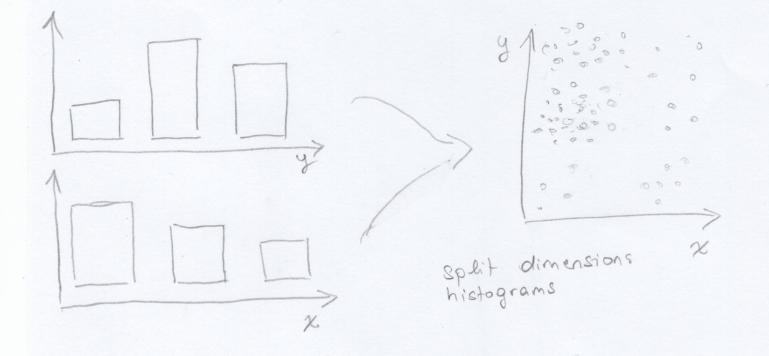 An image is worth a thousand words
We feel that given very large data sets, this might be an interesting way to aggregate it. It works as follows: the dimensions are split up into two (or however many dimensions there are) histograms that bin the number of points given in some range. That way the data distribution is visualized.
To show the correlation between the two dimensions, we propose that we add a color cue. On hovering a bar, the bars of the other dimension will change color to show the distribution of the points that were put into the corresponding bin, e.g. turn blue to show that few points of the selected bin were put into the other dimension's bin or green for quite many.
However, this would at best provide a rough overview over the data distribution (which is already a pretty sweet deal when you're dealing with Big Data, but we probably won't) and might be alienating to any users, who probably expect a simple scatter plot instead.
- Heat map (similarities)
-
This chart displays the points in the output order on both axes and maps the colors to the similarity (e.g. inverse distance) of the points. This way, clusters are visible along the diagonal. Hierarchial structures are also visible.
- Heat map (jump distances)
-
An alternative application of a heat map would be to sort of merge the scatter plot with a heat map, dividing the area into small rectangles and coloring them according to the jumps that were made between points---with small jumps being high similarity. This way, we actually display the densities of certain regions, which are already enough to reveal any clusters, and get rid of the actual points (which may be toggled on demand) to avoid clutter in case of large data.
This may, however, be hard to implement---or at least implement so that it works well.
- Scatter plot with jump paths
-
Another spin on the scatter plot would be to show the actual jumps that the algorithm makes between points, like it is done in the graphic at the top of the page. This would illustrate how the algorithm works and provide a connection to the reachability data.
- Bar chart (reachability)
-
Although we think that bar charts = boring charts, we think that the reachability is best visualized using, well, bar charts. For one part, they allow for easy comparison of reachability lengths, as the height of the bar immediately corresponds to the length of the jump, so no thinking required.
Furthermore, bar charts have always been used to visualize the reachability, so it has become canon. Someone who is well-aquainted with the algorithm might be thrown off if we used something different.
- Bar chart (cluster sizes)
-
It may be desirable to also show the make-up of the data using the different cluster sizes. This can be done using a bar chart.
- Bubble chart (cluster sizes)
-
It is also possible to display the cluster size information in a more fun way by using a bubble chart. However, we feel that the use of spheres may be a bad choice---historically, the OPTICS algorithm was a great idea because it is able to find clusters that are NOT sphere shaped, by looking at densities. A bubble chart looks like clusters, so it may be confusing to imply that the clusters in the data are somehow also spherical.
- Area chart (clusters with different cutoffs)
-
The cutoff distance is the parameter to play around with, and can drastically alter the resulting clustering. As a reminder, the cutoff distance mandates which points (whose jump distances all fall below the cutoff) get lumped together in a cluster.
We could draw an area chart over different cutoff distances and show how the clusters start to fall together given larger cutoffs. This could then be used to indentify critical cutoffs, i.e. after how large a cutoff the result starts to be no longer useful. This also tells a story on graph hierarchies, with larger cutoffs showing clusters that would be further up on the dendogram.
This could also be used to display effects of different parameters, e.g. the min points parameter. It could also be altered to only show the ratio between points classified as noise versus points classified as cluster points.
- Dendogram (hierarchial clusters)
-
A dendogram is the weapon of choice when wanting to show hierarchies in a clustering. Here, we could define different cutoffs for sourcing the data to display, although this might be tricky to get to work right on many different data sets. This could be solved by enabling user intervention, i.e. having the user pick cutoffs (which is also a great thing to play around with).
The implementation of this might be a little more involved.
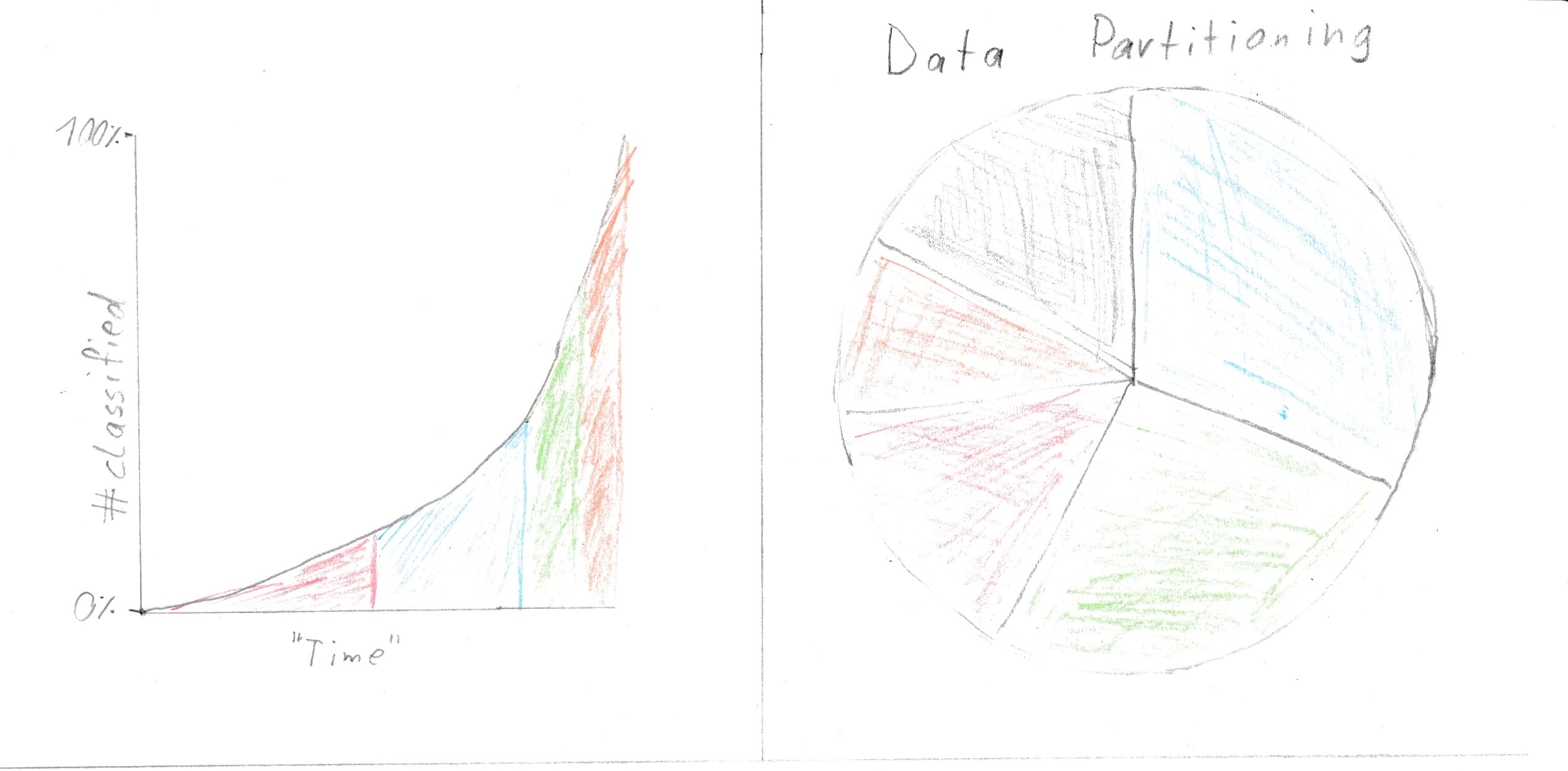
- Line chart (points classified over time)
-
It might be useful to show the progression of the algorithm over time. This could also give a feeling for the algorithmic complexity of the algorithm, and how different parameters affect its runtime in contrast to the amount of points for a specific data set. We could also use an area chart because line charts tend to look flimsy.
- Bar chart (average reachabilty within cluster)
-
A bar chart could also be used to show the average reachability within one cluster. A smaller average density would mean a denser cluster, which might be more interesting to the user than the cluster sizes.
Mockup 1
The charts [1] and [3] are necessary in each of our visualizations since those are fundamentally important
for understanding the algorithm. The right hand size charts can be exchanged for other plots that show
different meta information.
Chart [1] is needed because it is the only reasonably viable option to actually show the data, that is
being worked on. Without this chart there is no way to intuitively compare the algorithm with what a
human would conceive as clusters.
Chart [3] is needed because this is the output of the algorithm. If someone later on wants to use
the algorithm the only thing they will get as output is the data visualized in this chart. Since the
whole point of our implementation is to explain the algorithm and visualize its results, it is essential
to show this data. All other charts are based around the idea to make this data more understandable.
- Shows the points with their cluster coded as color
- Shows the clusters with the amount of points contained, as well as the noise points in gray.
- Shows the Reachability Plot with the reachability distance for each point and the cutoff line that defines clusters
- Shows the average reachability distance within the clusters, lower meaning a denser cluster
- When mousing over any of the bar charts the points belonging to the according cluster will be highlighted in all other charts, mousing over points has the reverse effect.
- Zooming is enabled inside of the scatter plot.
- Clicking on a bar of a bar chart hides other points in the scatter and reachability plot and gives the other bars transparency.
- The cutoff line can be dragged to redefine clusters. All charts and data will be reevaluated and changed accordingly.
- The "Data"-Button lets you copy text into a text box, which gets interpreted and used as data for the algorithm.
- The "Settings"-Button lets you define the Epsilon and MIN-Points for the algorithm as well as define a value from which on distances are being handled as if unreachable ("Context Infinity"). This value is therefor also the upper bound for the reachability plot.
Advantages:
- Nicely shows the points
- Cluster information can be seen easily
Disadvantages:
- Difficult to correlate points with reachability value
- May produce ugly visualization with bad parameters
Mockup 2
Charts [2] and [4] (Mockup 1) may be swaped out for those or the heat map(sketched in m1).
- Shows classification progress over time.
- Shows the clusters with the amount of points contained, as well as the noise points in gray.
Advantages:
- (chart 1) Shows algorithm progress over time
- (chart 2) Data partitioning(result) may be easy to recognize
- (heat map) Can reduce the dimensionality to 2 if the data set has more than 2 dimensions and visualizes nicely cluster and sub cluster structures without need for a cut off line
Disadvantages:
- (chart 1) It is difficult to predict how useful progress over time is?
- (chart 2) A bar chart may be better fit and more readable
- (heat map) May need some thought to be understood
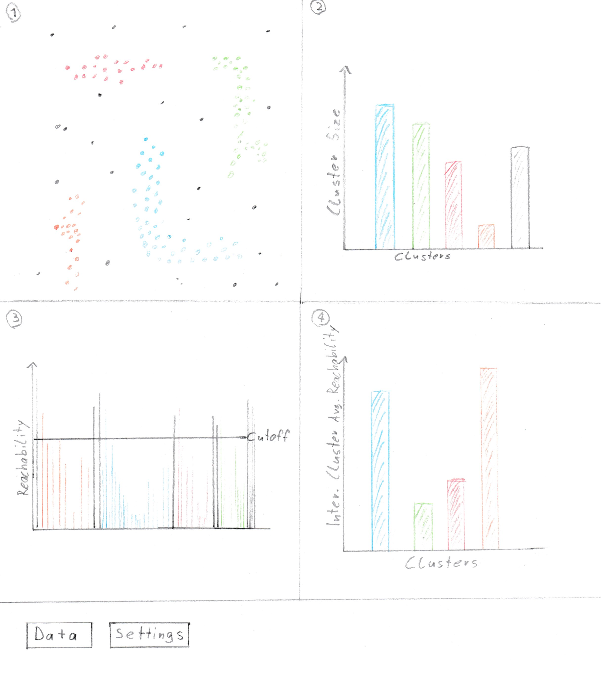
Mockup 3
The details on this mockup are not quite accurate but give a rough idea of how the results for a given data set may look like.
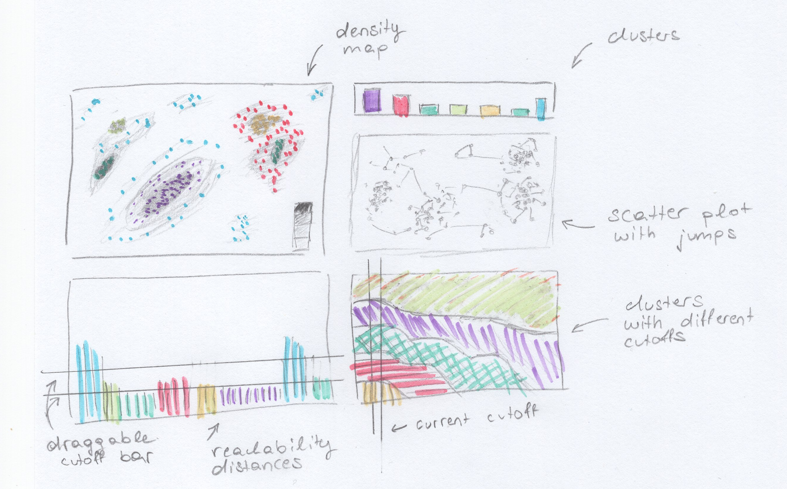
For this mockup, we have picked 5 charts from the chart pool above, namely a density map that also shows points (these can be toggled off to decrease clutter), a scatter plot that also displays the jumps between points that the algorithm made, the good old bar chart that shows the reachability distance in the order that the algorithm generated them, as well as an area chart that gives an overview over how the clusters change with increasing cutoff distances, and another simple bar chart that shows cluster sizes (or noise, which are aggregated into one pseudocluster) by number of points.
The charts are enumerated starting at the top left and clockwise.
- Density map
-
This view shows a density map. Since OPTICS is a density-based clustering algorithm, displaying the densities is a natural choice.
It might be desirable to view the actual points, however, so an option for toggling the data points (as in a normal scatterplot) should be included. These points could then also be colored to correlate with the other views.
- Bar chart (cluster sizes)
-
This view shows the cluster sizes. The colors are picked to relate to the other views.
- Scatter plot with jump paths
-
This view shows the data points along with the paths that correlate to the jumps displayed in the reachability bar chart. The jumps are colored according to the cluster, according to the colors of the bar chart and other views. Hovering a bar of the reachability chart should highlight the corresponding edge.
- Area chart (different cutoffs)
-
The area chart shows how the ratio of the different clusters change as the cutoff distance increases. This shows some hierarchical information as only adjacent clusters merge. The effect can be replicated by dragging the cutoff bar on chart 5.
- Bar chart (reachability distances)
-
This view shows the reachability distances (the lengths of the jumps) in the order computed by the algorithm. This is a staple OPTICS chart and would probably be included in even the most avant garde OPTICS visualizations.
A bar can be used to change the current cutoff distance. Multiple cutoff bars are also possible, which would then reveal hierarchical cluster structures (e.g. as shown in the density map, with denser inner regions (cores) and less dense outer regions ("suburbs")).
User interface
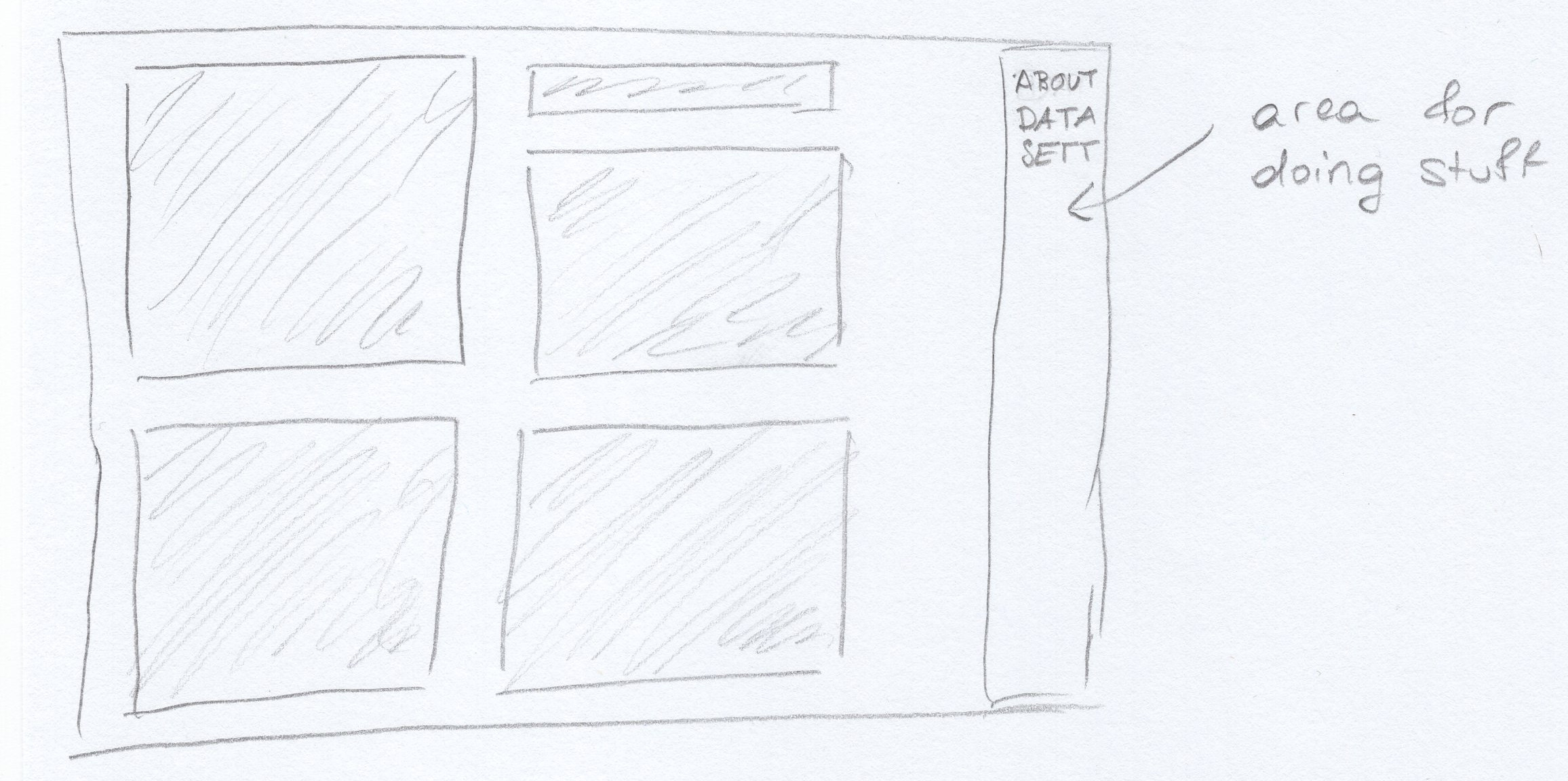
The user interface will consist of a side bar on the right side with three sections (buttons) to press. On press the bar will expand a little and show general information about the algorithm (about), or show a text field for pasting data (data), or show settings for the algorithm (in the form of sliders for e.g. cutoff distance, most likely).
Advantages
- High density of information
- Visualizes density (OPTICS works on densities, so good choice of vis)
- Shows jump paths, makes it possible to reconstruct the choices the algorithm made using reachability and jump paths---educational
Disadvantages
- Showing cluster ratios for different cutoffs may not really be useful after all, and would also be non-interactive
- Might be too much going on
Visualization techniques
Most of the visualization techniques that we picked can find use in any constellation of charts, so we will cover them in a general manner.
- Aggregation
-
Clustering is a form of aggregation, so any clustering visualization will make use of aggregation as soon as the points are assigned their cluster ID and this is somehow visualized, as the points are then aggregated into groups defined by their cluster ID. In our case, the cluster membership is communicated using colors.
- Heat maps
-
A clustering can be visualized by placing similar values in close proximity and using their similarity as an index into a color scheme. This is displayed in mockup 4.
We are unclear on the technicalities, but the density map of mockup 3 could possibly also be considered a heatmap mapping point densities to colors.
- Tooltips
-
We will be using tooltips to convey exact data---e.g. a bar chart depicting cluster sizes can only convey approximate data (unless you reverse-engineer the formula for the rectangle size and count the pixels somehow), but hovering the bar will create a popup that will give the exact size of the cluster in question.
- Brushing & Linking / Context and Focus / Zoom
-
We plan on incorporating especially linking and having other views react to selections made in different views, e.g. highlighting a reachability bar in the reachability distance bar chart will highlight the corresponding jump-path in the scatter plot with jump paths (see mockup 3).
Brushing can be used on either the scatter plot (selecting a group of points) or the reachability distance bar chart (selecting also a group of points, but in a given order). The first variant would update the other views to only show data relating to the points that are contained in the selection (possibly prompting expensive recomputation), while the second variant would zoom in on the scatterplot, as consecutive points in the bar chart are expected to be in close proximity to each other.
This behavior somewhat resembles the context and focus pattern, with e.g. the reachability acting as a context and the other views reacting to focus the selection.
- Filter
-
Selecting a cluster (in the cluster size chart) will all relevant views focus on data pertaining to only this one cluster. This overlaps somewhat with the previous techniques.
Mockup conclusion
After our mockups we concluded, that our implementation will probably look something like this:
- Scatter plot with jump path / exchangeable with density map
- Bar chart with cluster sizes
- Reachability plot
- Heat map (similatities)
Scenario of use
A typical scenario could be a teacher at a university, wanting to show how OPTICS can be used. For this, said teacher would first enter data in the corresponding menu and edit the algorithm settings. Next the data is shown and the different charts show the clusters and some meta data. With those, the reachability plot, which usually is the only output, can be further explained for better understanding. Additionally the parameters and cutoff line can be adjusted to see how those affect the output.
An even more concrete step by step way to use this for research could be:
- Click "Data" Field
- Load in some data
- Go to "Settings"
- Define Eps/MINPts/"Infinity"
- Show the scatter plot/density map (the classification may not be nice)
- Look at the heat map, if it looks fine change cut off line, otherwise change settings
- Further tweak settings and/or cut off
- Analyse cluster meta information (e.g. cluster size)
- Think about how good this algorithm worked for given data set / how content you are with the results
- Rerun experiments / Decide if this algorithm is fit for given problem
- Use gained knowledge as you want
Implementation details
We will be using d3.js. We have tried it out (obviously) and have a rough idea of what it can do, and think that our ideas can be easily realized using it.
Milestones
Milestones are sequential in nature (they do build up on each other), but work will probably not stop immediately at the due date but fade out. It might be necessary to go back to work done for a previous milestone.
- Finalize ideation phase
-
Pick best parts of all mockups, combine into one and further flesh out. Think harder about feasibility (i.e. how hard to implement).
Assigned to: all
Due: 23rd November
- Preparation (non-vis parts)
-
Implement the OPTICS algorithm in a variant that supports everything we need for visualization (data collection, data parsing, etc.). Set up a basic skeleton including JS and HTML and UI parts.
Assigned to:
- Algorithm: Christian
- Skeleton: Sonja
Due: 26th November
- Non (or hardly) interactive visualization
-
Implement all views in a static way, without filtering and linking and stuff. Obviously keep in mind that this will later need to be implemented and take precautions to make this as painless as possible, don't just hamfist it like a crazed brogrammer.
Assigned to:
- Half of views: Christian
- Other half: Sonja
- Pick pretty colors and stuff: Sonja
Due: 1st December
- Interactive elements
-
Add interactivity, i.e. draggable elements, linky and brushy things, zooming. Finish the UI.
Assigned to:
- Zooming and Dragging: Christian
- Linking and Brushing, UI: Sonja
Due: 3rd December
- Testing, Debugging and adding some polish (e.g. usability)
-
Since interactive parts are almost guaranteed to be weird and buggy at first, test, test and then test some more. Maybe let strange people play with it. Get feedback and try not to argue with them.
Assigned to: all
Due: 10th December with days to spare
Maybe's, stretch goals
- Maybe let the user select a start point for the algorithm to explore its relevance
- Maybe let the user define a select next logic (first/last unexplored,random, min/max in some dimension)
Separation of Tasks
| Sonja | Christian | |
|---|---|---|
| Chart explanation | 90% | 10% |
| Mockup 1 | 0% | 100% |
| Mockup 2 | 0% | 100% |
| Mockup 3 | 100% | 0% |
| Visualization Techniques | 100% | 0% |
| Conclusion/Scenario of use | 0% | 100% |
| Milestones | 70% | 30% |
Milestone 3
Reminder of our problem
The problem we wanted to address is that the OPTICS-Algorithm is quite difficult to understand and is therefor probably often misused. On one hand we want our users to be able to explore the algorithm to see if it could fit their problems, on the other hand we hope to assist them in getting a feeling for parameters and their intrinsic meaning. Generally said our visualization aims to show what output OPTICS produces and to give a better understanding for what the meaning behind it is.Milestone 2 feedback
- Influence of Parameters
-
For the parameters we agree that it is important to let the user explore a broad range of the design space. We therefor implemented sliders and numerical text boxes, that allow for quickly changing them and comparing different combinations in a short time. We think, that showing multiple outputs with parameter ranges would not improve the understanding of the algorithm, because the amount of visual data would be overwhelming and changes may no longer be relatable to which parameter had which effect.
- Scented Widgets
-
We implemented a scented widget.
- Data sets
-
For now we decided to stick with 2-Dimensional data and a default data set, that can be swapped out for a user defined data set. Often the clusters may be visually obvious to the user, but our goal is to show what the algorithm finds with which parameter set.
- Pie Chart
-
We decided to not use a pie chart. It would have been hard to read and not given any benefit over the small bar chart, that we implemented for a quick overview. So we agree with the feedback.
- Split Dimensions and Hue
-
Yeah that was a dumb idea, sorry. Maybe the bars would be better off if they just changed their height. But this idea was not used in the hifi prototype anyway.
- 2D-Projection
-
Our idea was to allow to only show 2 selected dimensions. This would have given the user the possibility to explore different dimensions and he could see which of those already give nice visual clusters. For now we did not implement this, because it does not add any educational benefit and only makes it harder to understand whats going on. This is the opposite of what we want to achieve.
- Heat-Map
-
The heat-map shows how far points are away from each other (their real distance color coded). In general the algorithm works with reachability distance, that differs from the actual distance between two points. The idea is, that if OPTICS worked well points close by(in the output) should also be close to each other(real distance). Therefor the heat-map gives a good idea about clusters and sub clusters without even looking at the data set. This would even work for multi dimensional data and data in a non euclidean space.
- Bubble charts
-
More fun is really not enough to justify this chart. We agree that it is not as intuitive as other solutions, e.g. a bar chart, which is why we dropped the idea.
- Points classified over time
-
The idea would have been to show the runtime complexity by visualizing how many points were put through the algorithm after how much time. Our focus was on exploring the output and usefulness of the algorithm though, which is the reason why we decided against this chart.
Example use
We're running with our example data set for this example.
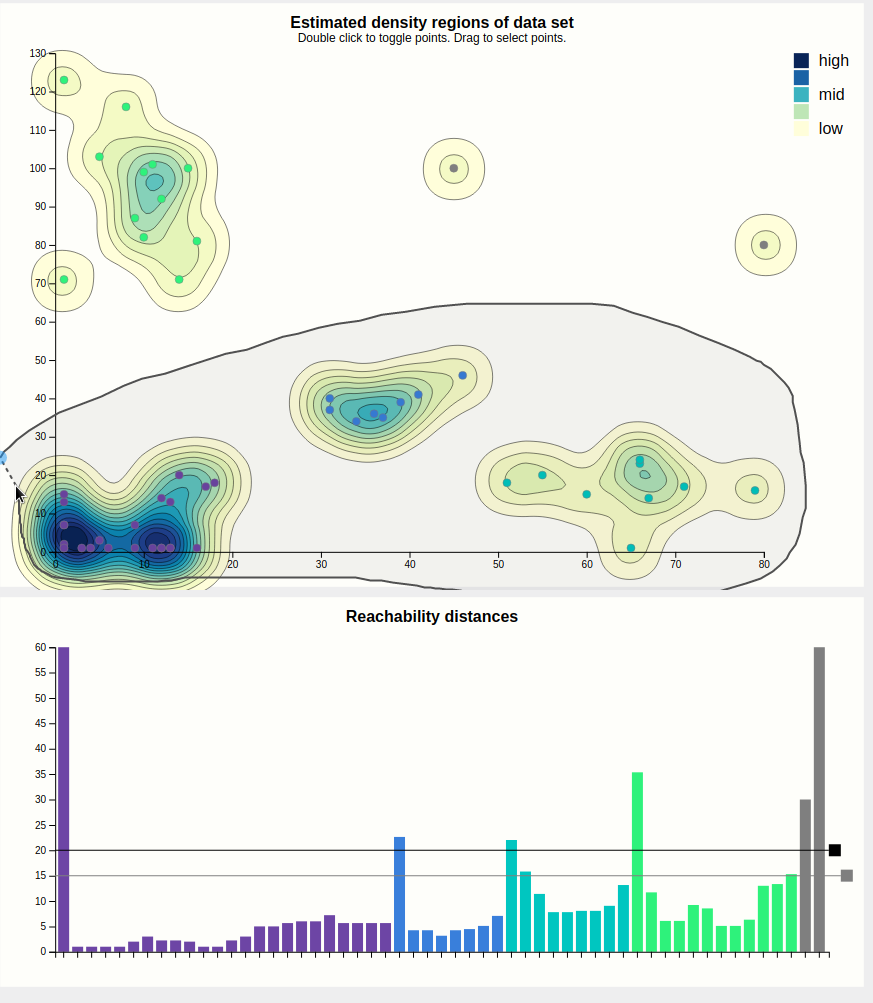
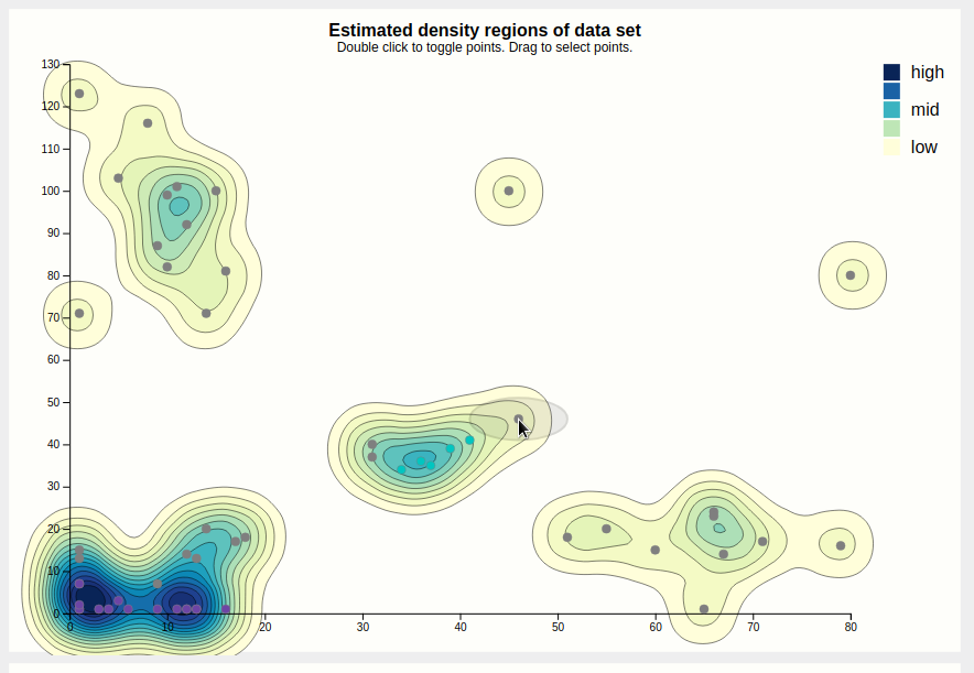
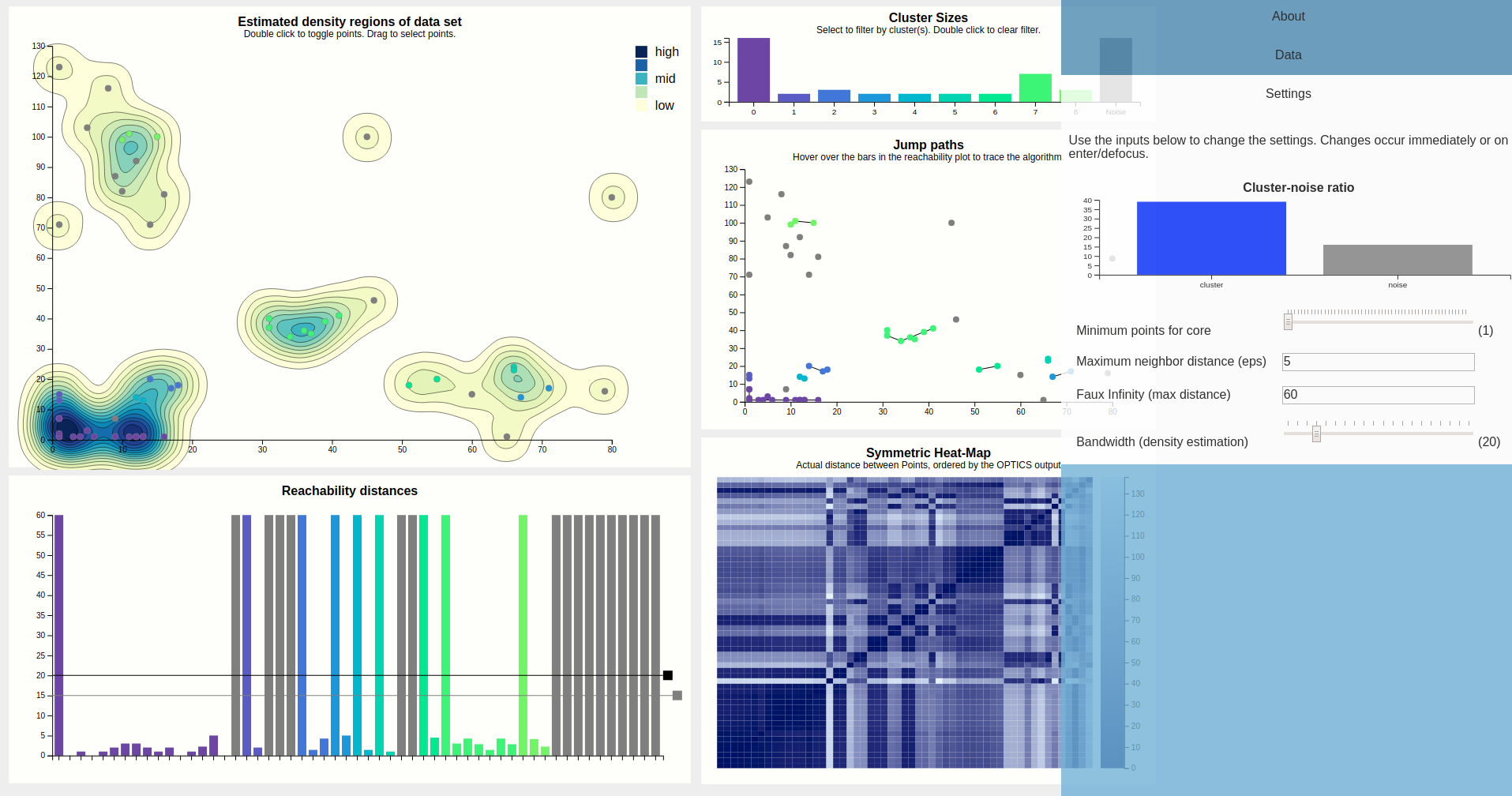
The initial view that is presented to the user is shown below. This includes (numbered clock-wise, from top left) a density map, a bar chart showing cluster sizes, a scatterplot showing the path the algorithm took (as lines between points), a heat map, and finally the reachability plot, which is a bar chart.
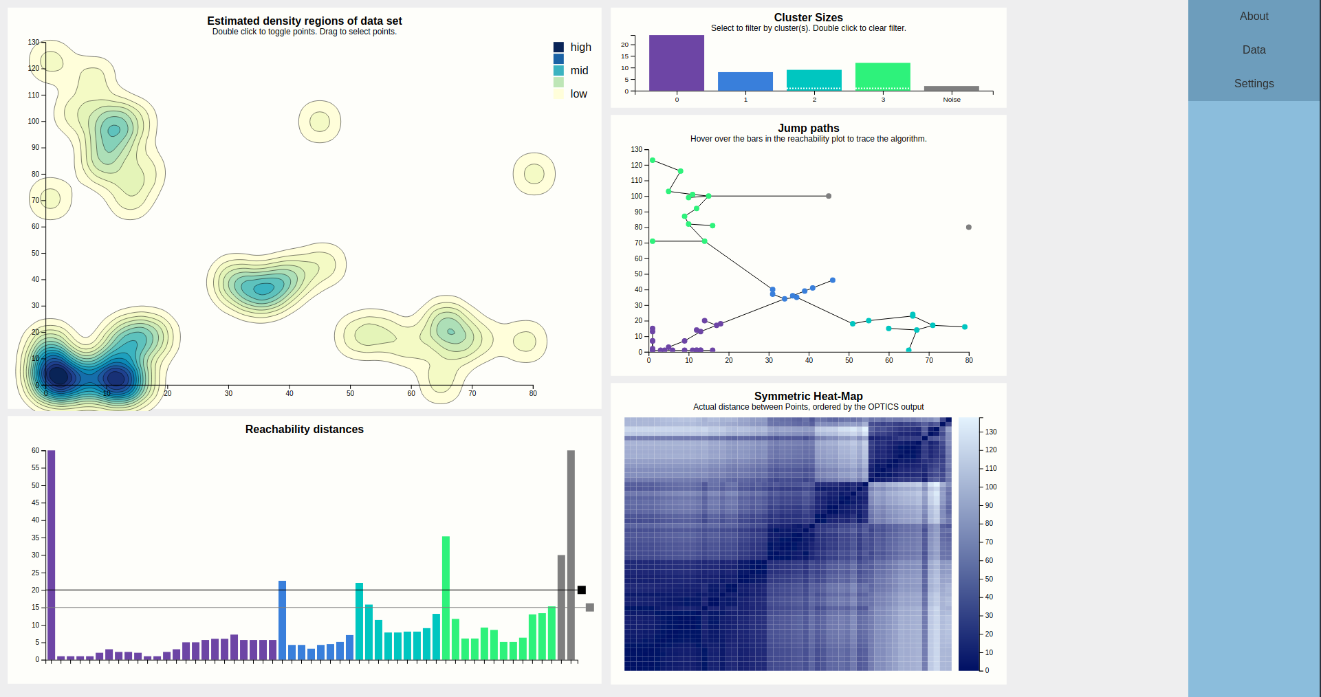
The largest chart is the density map. The main goal of this is to show the outline of the data using densities. These densities are estimated from the input points, using a Gaussian kernel so they tend to the round size. The contours of the estimated density curve are drawn. Since this is estimated data, it is possible to toggle on the actual data points, which results in the chart below. Since there is no natural ordering between faint yellow and dark blue, a legend is shown to clear that up.
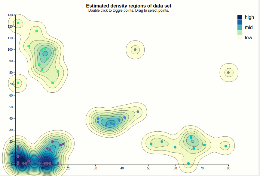
When the points are visible, they can be interacted with. Hovering a point displays the epsilon neighborhood of that point (squished to account for different scale domains), and highlights the corresponding bar of the reachability chart. This shows that this point was the fourth point visited, coming from the purple cluster, and that since the epsilon neighborhood contains plenty of other points (the minPTS was set to 4, for reference), OPTICS clearly found that this point is part of the cluster (as evidenced by coloring).
For clarity, entire groups of points can be selected. This is shown below. This is meant for presentation purposes, e.g. "Look at these clusters, if we increased the cutoff, these would likely be considered to be part of the same cluster."
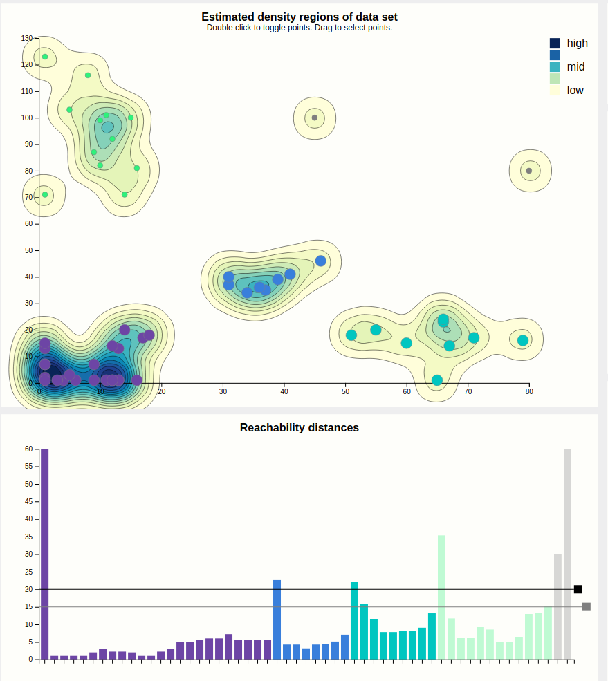
Case in point, let's increase the cutoff. This is done by dragging the black rectangle. We were right, and a cutoff of 25 results in the purple cluster taking over. Note that we left the secondary, grey cutoff bar alone. Looking at the cluster size chart, it shows the purple bar as segmented into three parts, showing the user that this cluster might actually be three clusters, i.e. contains hierachical clusters.

The bars of the reachability chart can also be hovered. They highlight the corresponding edge (the height of the bar is the length of that edge) in the density chart and the corresponding point (the target of the edge) in the density chart, should they be toggled. Also, a tooltip pops up telling you the reachability distance of that point. We can see that this jump went from the previously blue to the previously green cluster, and a distance of 22 is indeed higher than the previous cutoff, which is why these clusters used to be separate, but higher than the current secondary cutoff (the cause of the segmented bar of the purple cluster).

Since some points are very close together, the jumppath allows for zooming, which the density chart doesn't, to allow clear view of the edges and nodes if that should be desired. Below is an example, hovering over an edge between two points that are very close together.
Let's finally look at this mysterious heat map. At the first glance, it reveals the structure of the data set by displaying the distances between points as color hues, and keeping the order computed by the OPTICS algorithm.
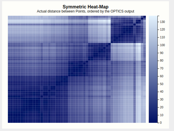
Four squares are readily apparent---they correspond to the four clusters found in the initial configuration. A bit less apparent, but still here, is a square that encompasses the first three squares---this is the large purple cluster that we have currently configured. To confirm this, lets drop the lasso-selection, lower the cutoff back to where it was before, and apply a brush to this larger square.
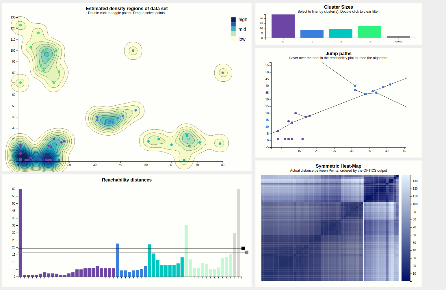
Indeed this highlights everything that was purple just now, so it would've pointed us to this larger cluster if we hadn't found it by dragging the cutoff bar around. A more experienced user would probably start his evaluation of the output with this heatmap.
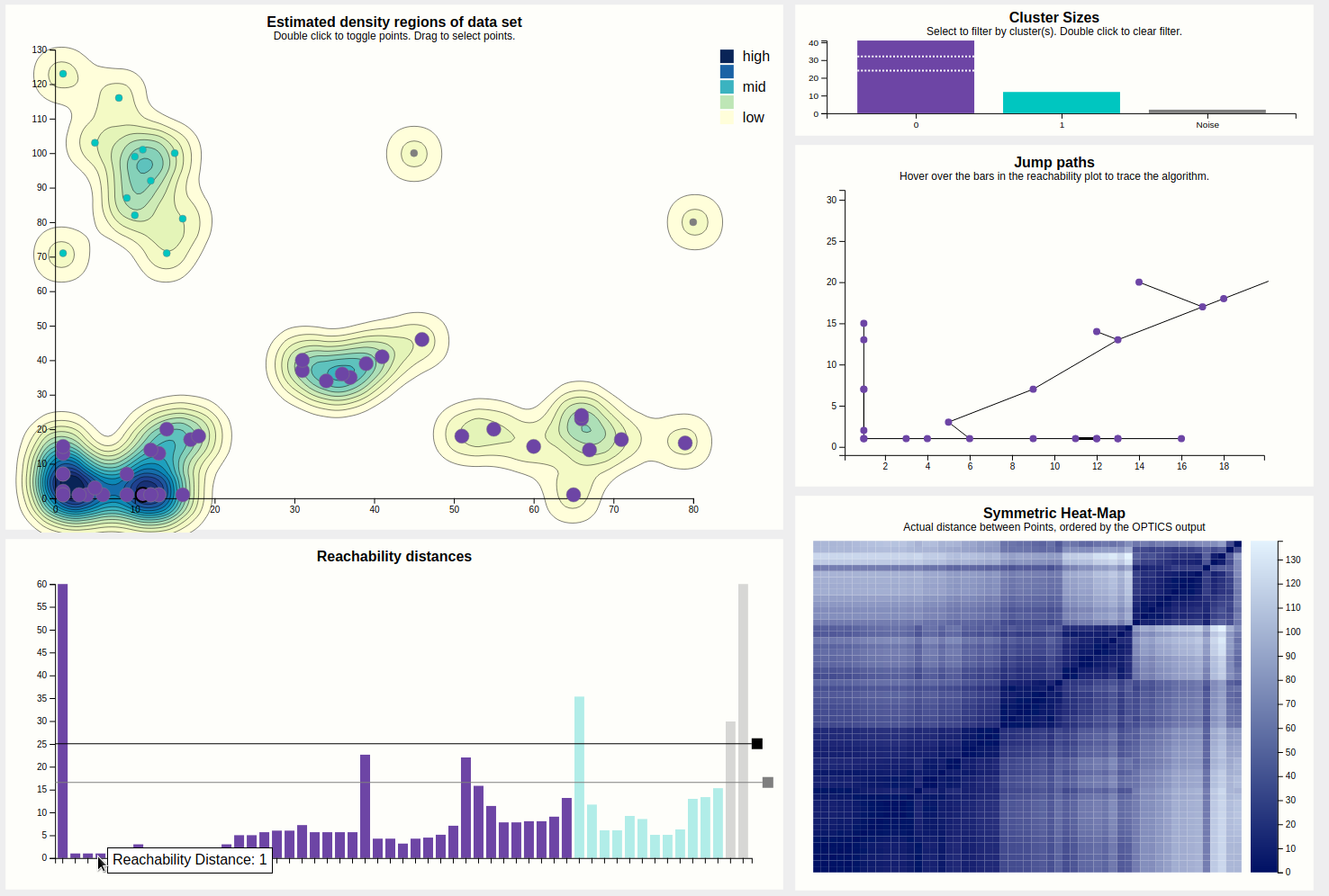
Finally, the output can be filtered by clicking on the bars of the desired clusters in the cluster size bar chart. Do note that selecting clusters that are not contiguous in the reachability plot will then appear to be continuous, which is a lie. This filtering is especially useful for getting a better view at portions of the reachability plot (especially for hovering) since it may get pretty crowded, but also filters the heat map, which may show if two clusters have similar composition regarding internal distances (by looking for patterns).
Let's look at the settings. Below is the expanded view of the settings tab.
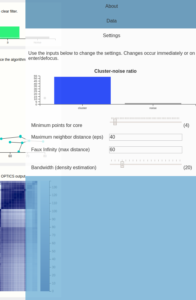
This shows a scented widget and inputs for the minimum points and epsilon parameters. It also shows an input for "faux infinity", which is what the algorithm uses to label "unreachable" points---this must be kept low since we are also drawing the bars that are unreachable. This could maybe be predetermined automatically but for this prototype, we left it in---if this is picked too large, small distances would disappear in the reachability plot.
We also provide a knob to tweak the bandwidth used during the density estimation. Unfortunately, the estimated density is dependent on the size of the svg in pixels---so it looks different on different resolutions, although the data is the same.
So OPTICS has two parameters, minPTS (minimum points that need to be in an eps-neighborhood query so the point is not immediately dropped due to too sparse neighborhood), and eps itself.
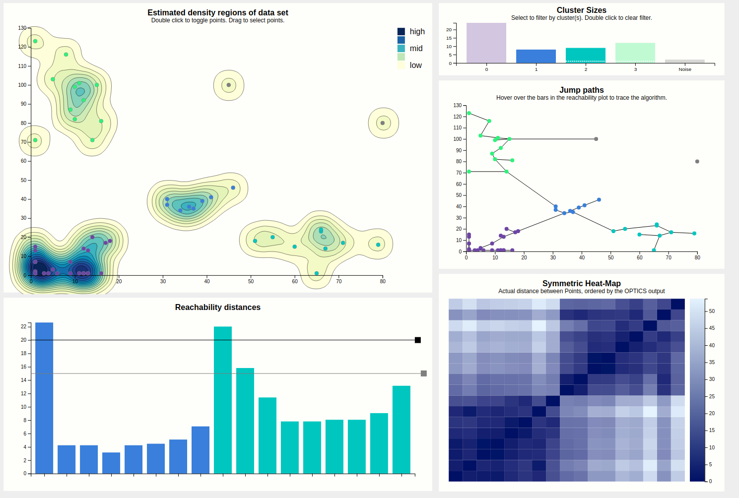
The eps parameter can, strictly speaking, be always set to infinity and yield perfect results, however this results in OPTICS being quadratic which is troublesome for big data sets. Thus, this parameter is mostly a performance tuning kinda deal. A rule of thumb behind setting this parameter is "so large the cluster/noise ratio stabilizes", although sometimes it can be useful to set it lower. A too low eps results in many points being classified as noise as the density of most clusters falls below the density required to have them classified as clusters with the given eps. Lets try it out and set eps = 5.
With this configuration, the algorithm clearly struggles, but still finds the cores of the purple cluster, which are quite dense compared to other clusters. We also see a great disturbance within the heat map. Clearly this configuration is bad. To further convince ourselves, we can hover a point of the density map to see just how ridiculously small this eps is compared to how the data is laid out.
The minPTS parameter is more interesting insofar that it is more than just a tuning parameter and actually influences how the algorithm makes decisions. The core idea is that small choice of minPTS could result in many micro clusters (doesn't have to and also depends on the choice of eps and the data of course), while a too large minPTS leads to points being classified as noise which might not be accurate. The bars of the scented widget update while dragging, letting go updates all views.
Increasing minPTS to 11 results in much noise, as most areas that were previously regarded as clusters don't even have that many points in total. The purple cluster survives as it is the densest of the lot.
Maybe if we were to set the eps very low, but also try to compensate by setting the minPTS very low, the results would be better? This turns out to not be quite true, and results in micro clusters.
Use-Cases
The use-cases for our project did not change from what we planed for in Milestone 2. The main task our implementation aims to help with, is to educate on how use OPTICS and to see if it fits given data and problem.
Teachers can either use our default data set or load a custom data set and explain how the algorithm works. Once the very basics are explained with our density map and the points (that show epsilon on mouse over), the reachability plot would be the next logical step. With its help and seeing what line corresponds to which point and jump the usual output of the algorithm should be clear. The next step could be to first play with the cut off, to see the different interpretations for one output of the algorithm. Then the parameters can be edited to see how a change of min points and epsilon counteracts small links between clusters. At last there may be a discussion about how a good selection of parameters is likely to produce a nice heat map, that may give a good overview over the general cluster structure and is easier to read than the reachability plot.
The second use-case in our mind was for researchers or anyone interested to find out if they want to do future work with this algorithm. For this they will probably just play around with our implementation to see if they want to put further work into OPTICS.
Changes to the original visualization design
Core changes were minimal. We picked mockup 3, but dropped the area chart depicting the different cluster sizes over time, and instead introduced the heatmap. The heatmap is an absolutely worthwhile chart to have, while the area chart would have been finicky to implement and would probably lead to no major insights that couldn't have been achieved by fiddling with the cutoff bar.
On a lesser note, we introduced small things like displaying the epsilon neighborhood of a point on hover, depicting subcluster makeup by size in the cluster overview, and zooming of the jumppath plot.
Techniques Used
We used the following techniques:- Filtering
-
Clicking on a cluster filters two views.
- Linking and brushing
-
Multiple views are linked, the heatmap can be brushed.
- Tooltips
-
Hovering over the reachability bars or the cluster size bar displays a tooltip. Other views would have had tooltips too, but some d3 behaviors need to have pointer-event stealing components overlaid (e.g. zoom, brush) which makes implementing tooltips on top difficult.
- Zoom
-
Jumppath chart can be zoomed into.
- Heat map
-
We have a heat map for showing cluster structures based on order and distances.
- Scented widgets
-
We implemented a scented widget for the two relevant parameters.
Challenges/Problems
Christian Permann:I found it difficult to force the brush on top of the heat-map in a position where it makes sense, because since the x and y-Axis are mirrored, any non square selection doesn't make sense.
The OPTICS implementation isn't the most efficient one and it may be a good idea to have a backend for the calculations.
Sonja Biedermann:I think the main problem that remains is how to make it behave well with larger inputs. Given a bad configuration (mainly a very large eps), OPTICS runs in quadratic time, and some components such as our scented widget will call the algorithm every time an input event is triggered, which may lead to an explosion of calls which all take n^2 time. This can't really be avoided (the output is needed to render the scented part), but maybe caching would cushion this effect. However, this depends on how often the same configurations would reappear, which may not be all that often.
Another issue is with the second cutoff bar. I think it would be nice if the subclusters would be assigned new IDs, however this seems to not be straightforward to implement. Since we're not too sure if it would be worth it, we decided to drop it and instead assign sub-cluster IDs. The relative sizes of the subclusters are then displayed in the cluster sizes chart as dashed lines, sort of cutting the main cluster into parts. That's not all that great and might be confusing.
Separation of Tasks
| Sonja | Christian | |
|---|---|---|
| Skeleton with Settings | 90% | 10% |
| Charts (non interactive) | 40% | 60% |
| Filter-Interaction | 50% | 50% |
| Zoom/Pan-Interaction | 50% | 50% |
| Highlight-Interaction | 60% | 40% |
| Algorithm | 10% | 90% |
| Web summary | 50% | 50% |